In order for you to be able to trade autonomously and effectively it is necessary to get comfortable with some fundamental types of forex charts which you are going to come across in your trading platform such as MetaTrader’s MT4.
What do you need to know about these exchange rate charts? Let’s find it out together!
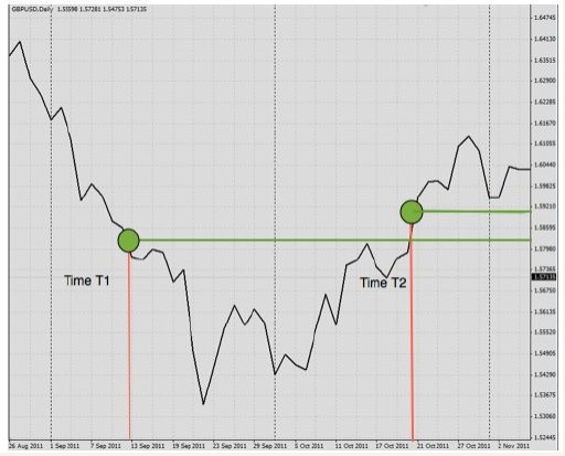
It is very easy to understand why people refer to the line chart as the easiest and more comprehensible kind of currency chart you can find in forex trading: It is represented by a line representing the movement of a currency pair over a period of time.
Let’s have a look at a sample graph and explain how to read it: Independently from the currency pair we are dealing with, the horizontal axis always indicate a time frame. The more we go on the left the more we go back in time and the more we go on the right the closer we get to the current value of the currency pair.

As to the vertical axis, it indicates the value of a pair of currency at a given point in time. For instance, in our example the value of the currency at the time T1 is given by the value that is generated by the crossing of the red line and green line. The same concept can be applied in case you would like to know the value of a given pair of currencies in time T2.
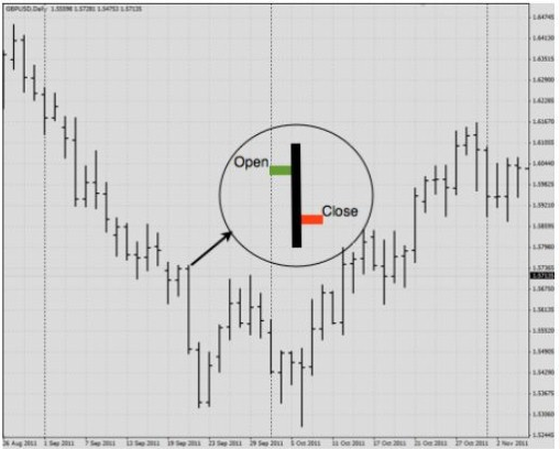
The bar chart is a little bit more complex than the line chart and therefore needs a bigger interpretation. Nevertheless, once understood how it works, it will be easy to use it. The bar chart shows the opening prices and the closing prices, and also the highs and lows of a pair of currencies at a given point in time.

Looking at the graph it is possible to identify a vertical line at each point in time. The bottom part of this vertical line indicates the lowest traded price for that point in time, while the top part indicates the highest price paid at that point in time.
As it is easy to understand, the bar chart is actually not much more complex than the line one, but it gives us a lot more information that are of high value for every trader.
We said the bar chart includes important information regarding the opening and the closing price at a given point in time. If we look closer at a single bar it is possible to identify two horizontal lines: the one on the left refers to the opening price of a currency pair at a given point in time, while the one on the right refers to the closing value of a pair of currencies of a given value at a given point in time.
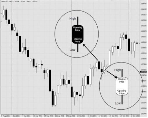
This kind of chart is nothing more than a prettier bar chart. They do include a large body in the middle of the vertical line which indicates the range between the opening and the closing price.
In case the block in the middle is colored white it means that the opening price is lower than the closing price. In case the opening price is the bigger one, the body will be colored black.
This is how a candlestick chart will look like in your Trading Platform:

You may ask yourself which type of foreign currency charts you should use. That depends entirely on the individual trader. Most professional traders prefer the candlestick chart as it gives the most vital information about a currency pair from a technical standpoint with the best presentation. Most traders at PaxForex prefer to use the candlestick chart for the same reason and it would be our recommendation.
Some traders prefer a different forex advanced chart which is perfectly fine. There is no right or wrong answer when it comes to choosing the right chart for you.