
- Descending Triangle
- Ascending Triangle
- Triple Bottom
- Double Top
- Falling Wedge
- Double Bottom
- Triple Top
- Price Channel Pattern
- Bump and Run
One of the main postulates of technical analysis is that all situations on the market are not unique, but have occurred before. So, knowing how this or that situation has been resolved in the past, you can make forecasts about the development of such a situation, if it has already happened before with this or that asset.
One of the important characteristics of a trading situation is the form of a chart of a traded asset. Analyzing the stock chart patterns for large periods, traders have found the existence of repetitive formations of different types, which, when formed in different markets and different conditions, led to a similar continuation of the price movement. Such formations are called graphical patterns.
According to what direction they predict the trend development, the patterns are divided into two categories: reversal and continuation chart patterns. Some analysts distinguish another category of undefined patterns (i.e. such patterns, which under different conditions can serve as a sign of continuation of the current trend, as well as a sign of its rapid reversal). Let us consider the most common and popular stock chart patterns and how to read them.
Descending Triangle
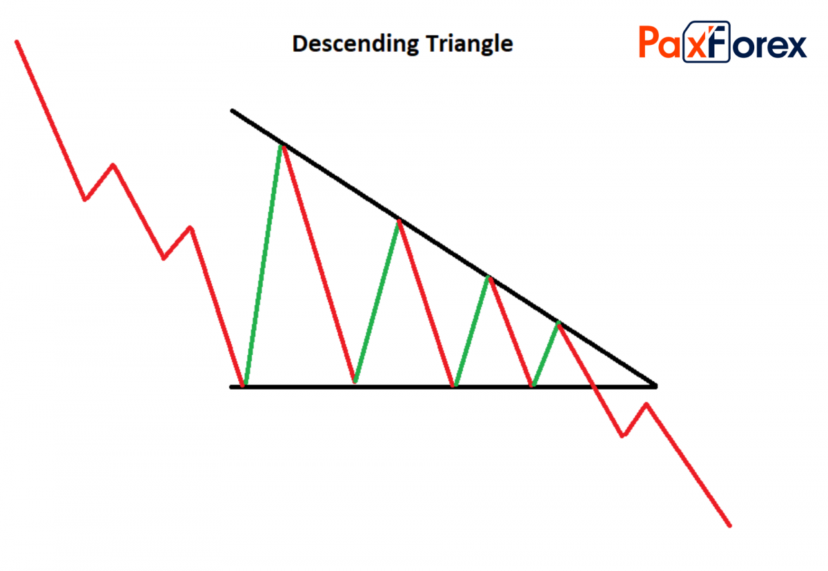
The technical analysis figure "descending triangle" foretells the price decrease, regardless of the previous trend.
A descending triangle is not a very common, but rather a simple figure of technical analysis. To form a figure, you need a clear support line with at least 2 touches, and a descending line of resistance, which forms the upper side of the triangle. Since the upper line is at a negative angle, and the lower line is horizontal, the resulting angle indicates right and down.
elements of the figure "descending triangle"
The price waves should form a clear support line. Naturally, it may not be perfectly horizontal and the lows may be slightly different, but it should be a horizontal support line with a minimum of 2 touches.
On the reverse side of the waves, price should draw a downward resistance line, i.e. a hypotenuse. The price should touch it at least 2 times.
The total duration of the descending triangle, as a rule, is 3-30 weeks. On average, 1-3 months is the most common duration of a descending triangle.
The trading volume during the formation of a figure usually decreases. But at the very end of the figure, the volume grows significantly.
When the price crosses the support line, the figure comes to the end. Often this final crossing is accompanied by a high trading volume.
The support turns into resistance, and after crossing the support, the price may reflect a new resistance before the downtrend.
The target price is equal to the height of the descending triangle, taken from the support line.
If you look at the "descending triangle" pattern from the psychological point of view, you can understand the price behavior. At the support level, there are many imaginary buy orders; bullish analysts are waiting for the share to crawl up at this level. Whenever the price goes down to this level, the bulls buy and thus force the price to rise. But the market is bearish.
Ascending Triangle
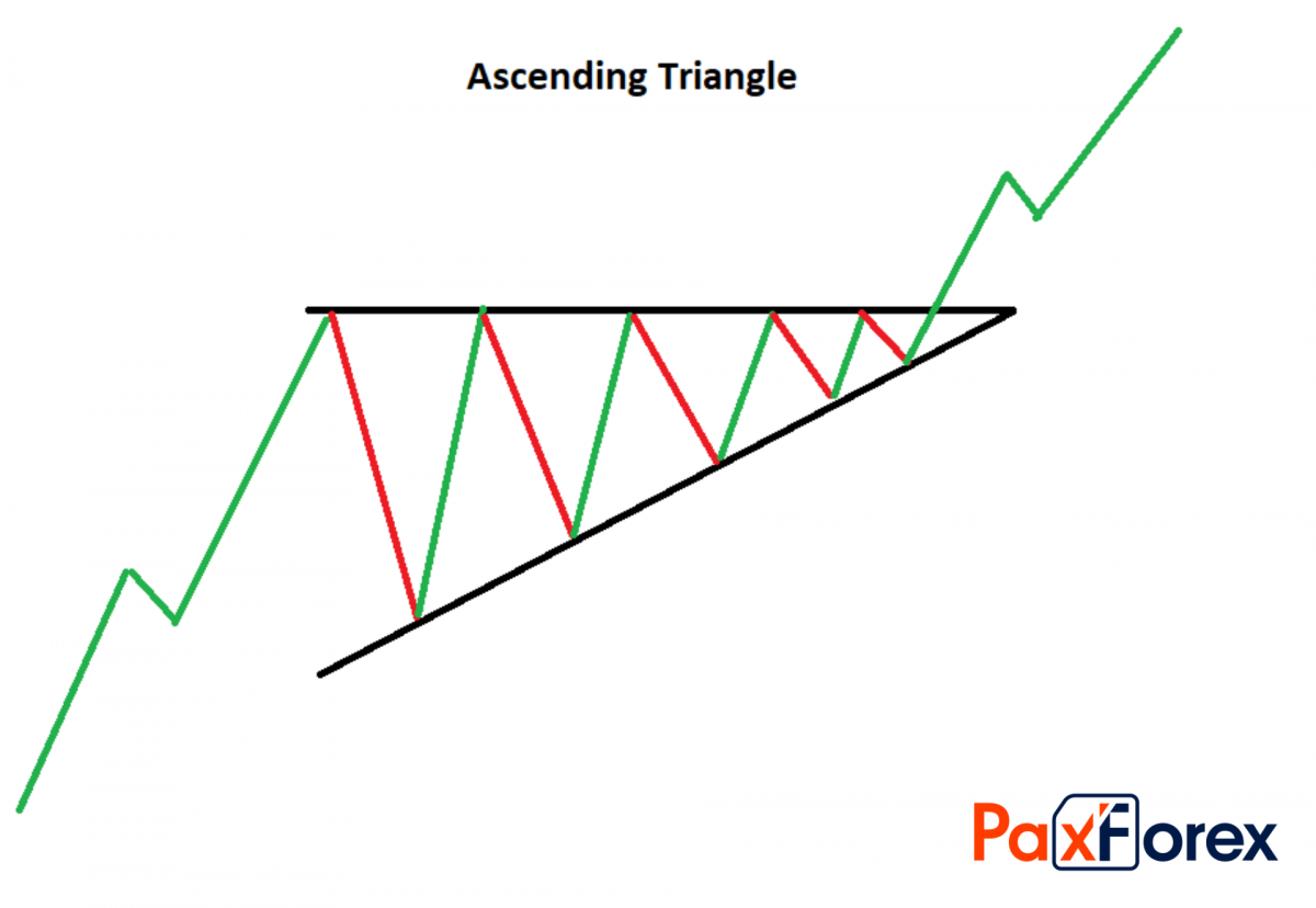
The ascending triangle is a technical analysis pattern, which foretells the price growth.
Similar to the descending triangle, no matter what happens before the figure, after the completion and confirmation of the figure, the price of the financial asset goes up.
As a rule, an ascending triangle is formed on an uptrend, thus continuing the direction of price movement. So, do not be surprised if you meet the description of an ascending triangle as a continuation of the trend. But sometimes it happens that the figure appears after the downtrend, thus reversing the price. Therefore, it is better not to treat the figure as relative (continuation, reversal), but to treat it as absolute (i.e. rise, fall). A detailed description of the ascending triangle as a trend continuation figure can sometimes occur after the descending trend, thus turning the price around.
Therefore, it is better not to treat the figure as relative (continuation, reversal), but to treat it as absolute (i.e. rise, fall).
The name of the figure speaks for itself. If we imagine that our triangle is rectangular, it will have a right angle at the top left. The upper cathetus is formed by the formation of resistance: we need at least 2 local maximums on the same level. The lower side of the uptrend triangle - hypotenuse - is formed by inclined support.
The ascending triangle is a very favorable figure for technical analysis, which, unfortunately, is not very common. It heralds price growth regardless of the direction of the previous trend. It is precise because the rising triangle is a bullish figure that traders and investors love and wait for it on the charts of their portfolio instruments.
Triple Bottom
The triple bottom is a simple reversal pattern of technical analysis, which consists of three equal minimums, and foreshadows the price growth.
The triple bottom is very similar to the double bottom but differs only in that it adds another minimum at the triple bottom. The triple bottom can be formed only after the downtrend, and precedes the uptrend: in other words, the triple bottom reverses the price up. If there is no downtrend before the figure and an uptrend after it, the triple bottom cannot be called a triple bottom figure.
Important elements of the reversal pattern triple bottom:
Before the triple bottom, there must be a long-term downtrend, or at least a horizontal (flat downtrend) trading period.
Three equal bottoms must be at the end of the preceding trend. The minimums of these bottoms must be approximately at the same level, and the peaks between the three bottoms must also be approximately at the same level, and form a kind of support and resistance lines.
The trading volume usually decreases gradually as the shape is formed. At the end of the shape, after the third-bottom, the volume may increase, which will only strengthen the shape.
The price crossing of the resistance line is the key point in pattern formation.
As usual after the key intersection, the broken line changes its essence (resistance line becomes support line). If the price goes down after the crossover and is reflected in the newly formed support, it will finally confirm the pattern.
The target price is equal to the difference between the resistance and support added to the resistance price.
The triple bottom in technical analysis is a simple enough figure of reversal for the uptrend. Graphically the triple bottom looks like three Latin letters V, placed next to it: VVV. In order not to make a mistake in determining the triple bottom, one should watch the trading volume and the intersection of resistance after the third bottom.
Double Top
A double top consists of two roughly equal peaks with a small bottom between them.
As a rule, the classical double top foreshadows at least a small change in the direction of price movement for a financial instrument. The main price movement that confirms the double top is considered to be the crossover of support from top to bottom.
Since a potential double top can be found quite often in an uptrend, technical analysts need to be alert and be able to distinguish the real double top from the fake one. Usually, at least one month passes between two peaks in the real double top pattern. If this period is shorter, then most likely these two tops just form a channel.
The price should fall by at least 10% after the first peak, otherwise, it will not be a double top pattern.
If the price rises after the bottom, pay attention to the trading volume and the following maximum: if the trading volume fell on the rise and the price at the spike is approximately equal to the price of the previous spike, then you see the real double top in action.
When analyzing double top, it is important not to rush! Wait until the price crosses the support line with high trading volume, and only then confirm the figure. It may be very appropriate to take a time or price pause after the price crosses the support line. During the pause, hold the asset (do not sell or buy) either for 3 days (temporary pause) or until the price falls 3% below support (price pause). Either of these methods will allow you to finally and surely confirm the double top stock chart pattern.
Falling Wedge
A falling wedge is a reversal pattern of technical analysis that manifests itself in a descending wave-like movement, whose amplitude decreases.
A falling wedge is formed at the touchpoints of two lines, which form an angle looking down to the right. An imaginary angle is the falling wedge. It is important that the price should touch each line at least twice.
In real trading, this figure is not that easy to detect. By nature, the falling wedge is similar to the rising wedge (mirror reflection) and the descending triangle. The figure usually lasts from 2 to 7 months; on average it is 3.
A falling wedge is a reversal figure. It means that it is impossible to say exactly where the price will go until the figure is finished. Usually, the price goes up, thus reversing the price, but this is not always the case. The direction of price movement after the complete pattern formation depends on the side from which the price has broken-down the pattern (i.e. from below or above). In its turn, it means that crossing the price of one of the straight lines is a key point for a technical analyst.
Double Bottom
Double bottom is one of the most common reversal figures encountered after a downtrend. The figure of the double bottom is very similar to the figure of the double top. These figures are identical, with the only difference that they are a kind of reflection of each other. As you have probably guessed, the double bottom figure consists of two roughly equal dunes, between which there is a slight climb.
As a rule, the classical double bottom heralds at least a slight change in the direction of the price movement for a financial instrument. It is important to note that on a downtrend you can see many potential double bottoms, but for a certain combination of prices in time to be called a double bottom figure, confirmation and completion of the figure is necessary. The main price movement that the double bottom confirms is the crossover of resistance from bottom to top.
As the potential double bottom can be found quite often in a downtrend, technical analysts need to be attentive and be able to distinguish the real double bottom from the fake one. Usually, there is a minimum of a month between two doubles in a genuine double bottom. If this period is shorter, then most likely these two bottoms simply form a corridor (with support and resistance).
Triple Top
The triple top is a simple figure of technical analysis that unfolds an upward trend; it looks like ΛΛΛ.
It is a technical analysis figure that reverses an uptrend, it can only occur after an uptrend, otherwise, it is simply not a triple top.
The triple top, although similar to the triple bottom, is different in that it is shorter: the triple top can take from a month to six months, while the triple bottom usually takes a few months minimum.
The shape is formed as the three tops are formed at about the same level. Ideally, the top levels should be at the same level, and the bottoms between them should form clear horizontal support.
Of course, in reality, geometric perfection is not achieved. But be careful, allow only a small percentage of inconsistency: the triple top is very easy to confuse with the head and shoulders and several other figures of technical analysis.
It is a simple and relatively frequent figure of technical analysis, which can be formed only after an uptrend and before a downtrend. Make sure not to confuse the triple top with your head and shoulders.
Price Channel Pattern
Trading on the price channel is popular in Forex as a reliable and proven strategy. The formation of such a figure makes it possible to visualize the trend dynamics at a certain time.
The price channel is an area on the price chart that is limited by two lines. The lower line shows the minimum price, and the upper line shows the maximum price, respectively.
The price channel lines correspond to the resistance and support levels. These lines are drawn on the most significant minimums of the price graphical representation and its maximums.
The width of the obtained channel directly depends on the timeframe used.
The two most popular strategies use the price channel pattern are:
When trading on a breakdown, it is assumed that if the price breaks-down one of the levels, it is likely to continue moving in the same direction. For this reason, positions should be opened towards the breakdown.
When trading on a reversal, the nature of the price value change within the price channel is taken as a basis. The width of the price channel is taken into account. If the price channel is wide enough, a position can be opened by or against a trend, but the latter variant turns out to be more unpredictable and riskier.
Trading in the price channels on Forex brings three types of signals to the trader:
Approximation of the price to the border and rebound from it. You should open a position only if the price deviates from the border sufficiently.
Channel breakdown. This behavior of the price is not considered to be particularly dangerous, as trading takes place in the direction of the main trend. It is important to sift out random signals with the help of other confirmations. For example, you can pay attention to the dynamics of trading volumes.
Breakdown of the trend line. In this case, there is a cause for concern. The position appears to be open against the emerged trend. It is obligatory to apply additional tools to confirm the situation.
Bump and Run
The bump and run reversal pattern appears after a fast and large price hike due to excessive speculation. The pattern starts with a lead-in phase in which the prices advance normally without any signs of excessive speculation. The trend line during the lead-in phase is moderately steep.
The second phase of the pattern is the bump phase, in which prices increase rapidly compared to the first phase. During this phase, the trend line becomes at least 50% steeper compared to the lead-in trendline. Traders should validate the bump pattern by checking the max—height of the bump concerning the lead-in trendline. The distance from the highest point of the bump to the lead-in trendline should be two times (or more) the distance from the highest high in the lead-in phase to the lead-in line.
After prices reached their peak and start to decline towards the trend line, the chart begins to show the right side of the bump. Volume expands after the advance forms on the left side of the bump. The run phase starts when prices reach the lead-in trendline.
After passing the trendline, sometimes the price also retracts to the trendline, which is now also the resistance level. The bump and run reversal pattern can be used for all types of trading, from daily, to weekly, to monthly, with the understanding that the movement is unsustainable for a longer period. It can be applied to any chart duration, daily, weekly, or monthly.
Summary
All in all, knowing how to read stock chart patterns will make your trading more profitable. Additionally, we recommend you using them on higher timeframes and/or have a confirmation indicator.
One way or another, having a wide range of indicators today allows you to create an excellent trading strategy based on stock chart patterns. It is worth making use of all opportunities to make your trading more successful and will help you to make informed decisions.


